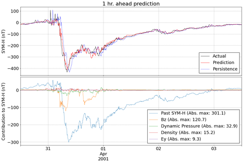
Interactive visualizations
In order to better visualize feature contributions, we created two interactive visualizations using Plotly. These should be mostly self-explanatory but here are some tips to get the most out of them:
-
Use the dropdown menu to view predictions/feature contributions from different test storms*
-
Use the legend to select/de-select features. Double click the legend to select all.
-
Click and drag to select specific sections of the plots to zoom into.
-
Hover over plots to get more specific information (e.g. date, SYM-H value, contributions, etc)
-
Since features are on different scales, the last plot is only useful when isolating one feature at a time.
-
Download a static version of current plot by clicking the camera icon on the top right
1 hr. ahead prediction with past SYM-H as input
1 hr. ahead prediction without past SYM-H as input
* Only a subset of test storms are shown here due to Github’s file size restrictions